
How to Use the 60-30-10 Rule to Build a Balanced Color Palette
You have a paint swatch you love, a sofa in a different shade, and a Pinterest board full of colors that all look great separately. Together? No idea. The 60 30 10 rule is the simple formula designers lean on to make any combination feel intentional, and you can learn it in about five minutes.
In this guide you will get the formula, a practical way to measure it in your own room (no math required), room-by-room examples, the mistakes that trip up beginners, and permission to break the rule once you understand it.
What Is the 60-30-10 Rule? (And Why It Works)
The 60-30-10 rule is a proportion guide for color. Sixty percent of a room is your dominant color, thirty percent is a secondary color, and ten percent is an accent color.
The ratio echoes the same balance you see in nature, art, and photography, where one element leads, another supports, and a small surprise adds interest. Our eyes read that kind of hierarchy as calm and finished. When every color gets equal airtime, a room feels busy. When there is only one color, it feels flat. The 60-30-10 split sits in the sweet spot between the two.
It also takes the guesswork out of decisions. Instead of asking “does this pillow go?”, you ask “which slice of the formula is this?”
Breaking Down the Three Percentages
60%: The Dominant Color
This is the backdrop, the color your eye rests on. Think walls, and sometimes the ceiling, a large rug, or big pieces of furniture. It is usually the quietest color in the palette because there is so much of it.
30%: The Secondary Color
The secondary color adds contrast and depth. It lives in medium-sized items: upholstery, curtains, an area rug, bedding, or an accent chair. It should be clearly different from the dominant color but still related to it.
10%: The Accent Color
This is the personality pop. Throw pillows, artwork, lamps, vases, a small ottoman, or a bowl on the coffee table. The accent is usually the boldest, most saturated color in the room, and because it only takes up a small share, it can afford to be.
One note that surprises beginners: neutrals count as colors. White, greige, black, and natural wood tones each take a slice of the ratio. A room with white walls, a gray sofa, and a rust-colored throw is a perfectly valid 60-30-10 palette.
How to Actually Measure 60-30-10 in a Real Room
Nobody walks around with a calculator. You are estimating visual weight, not square footage.
Try the squint test. Stand in the doorway and squint until the details blur. You should see one big color field, one medium field, and a few small spots. If you see three equal blocks, or lots of competing spots, the proportions are off.
Start with the biggest surface and work down.
- Lock in the 60% first. In most rooms, that is the walls.
- Layer the 30% into medium-sized items like the sofa, curtains, or rug.
- Sprinkle the 10% through small, easy-to-swap pieces.
Work around what you cannot change. If you have fixed flooring, tile, or a sofa you are not replacing, treat those as a locked slice of the palette and build around them. A big brown leather sofa might become your 30%, which tells you what the walls and accents need to do.
Picking Your Three Colors (Color Wheel Basics, Simplified)
You do not need color theory training. These pairings cover most situations:
- Neutral + one color + a punchy accent. The safest starting point. Think warm white walls, a sage green sofa, and terracotta accents.
- Complementary colors. Colors opposite each other on the wheel, like blue and orange, create energy. Use the quieter one as your 30% and the stronger one as your 10%.
- Analogous colors. Neighbors on the wheel, like blue, blue-green, and green, feel soothing and cohesive. Add a small contrasting accent so it does not tip into boring.
If you are still narrowing down which colors belong in your home at all, our complete home color palette guide walks through it step by step. And since neutrals do so much of the heavy lifting here, it helps to know the best neutral paint colors before you commit to a 60% shade.
The 60-30-10 Rule Room by Room
The formula stays the same, but the way it shows up changes from room to room. For more ideas across the house, browse our Decorating articles.
Living Room
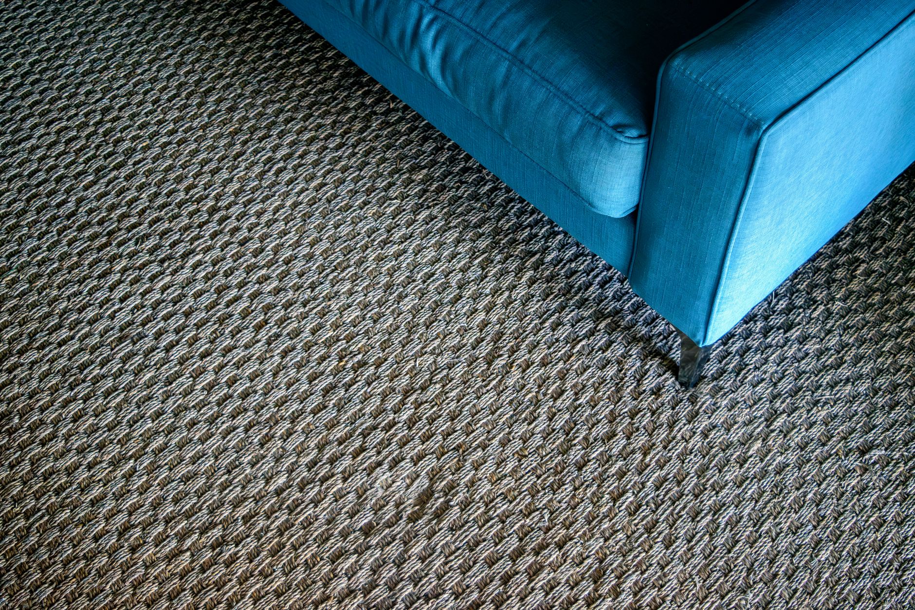 Photo by Thomas Parker on Pexels
The classic example. Warm white walls (60%), a deep blue sofa and curtains (30%), and mustard or terracotta pillows, art, and a vase (10%). It is easy to expand because there are so many places to repeat the accent.
Bedroom
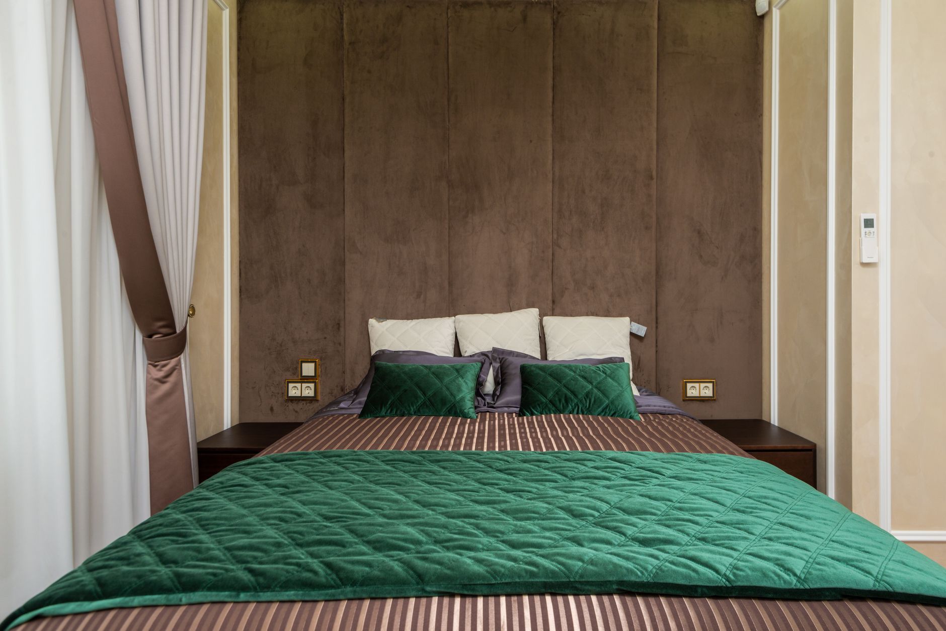 Photo by Max Vakhtbovych on Pexels
Go softer and lower in contrast, since this is a room for rest. Try soft greige walls, bedding and a headboard in muted sage, and a small hit of deeper green or brass in lamps and a throw.
Kitchen
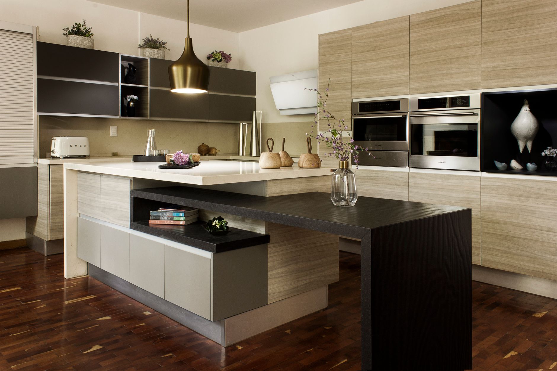 Photo by Alan Quirván on Pexels
The dominant color is often the cabinets or walls. Use the 30% for the island, backsplash, or window treatments, and bring in the 10% with hardware, stools, a runner, or small appliances.
Bathroom
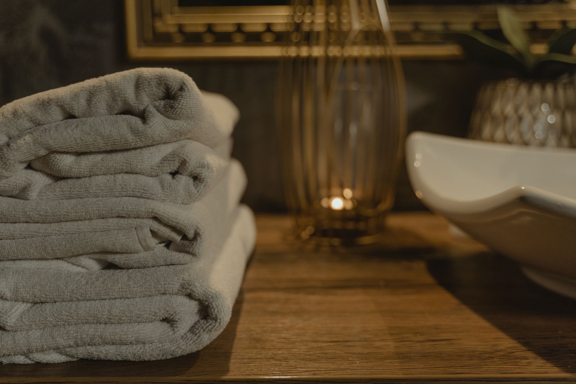 Photo by Tima Miroshnichenko on Pexels
Tile and walls usually make up the 60% and 30%. Towels, a plant, a soap dish, and artwork carry the 10%. Because bathrooms are small, towels are an easy way to swap the accent seasonally.
Small Spaces
Keep the accent tight and let close-toned neutrals do most of the work. When the walls, large furniture, and rug are similar in tone, the room feels larger and more open. Save the bold color for a few small, repeatable details.
Common Mistakes to Avoid
An accent that whispers. If your 10% is barely different from the rest of the palette, the room reads as bland. The accent should be noticeably bolder than the other two colors.
No clear dominant color. When all three colors compete for attention, the room feels chaotic. Decide who is the lead and let the others support.
Forgetting that pattern and texture add weight. A bold patterned rug carries more visual weight than a plain one of the same size. A chunky knit throw counts for more than a thin cotton one. Factor that in when you estimate your proportions.
Treating the ratio as gospel. It is a starting point, not a test you can fail. If the room looks good to you, it is right.
When (and How) to Break the Rule
Once your eye is trained, bend the formula to suit your style:
- 70/20/10 for a calmer, more neutral look with a smaller dose of the secondary color.
- 60/30/5/5 to split the accent into two colors when you want more variety without chaos.
- Monochromatic palettes, where you use one hue in different shades, and rely on texture to keep it interesting.
Designers also stretch the rule for bold or maximalist rooms, where a saturated color might take up far more than ten percent. The trick is the same: keep one color clearly in charge so the room still feels organized.
If you want to practice with something low-risk, try the formula on one wall first. Learning how to add an accent wall is a great way to test a bolder color without repainting the whole room.
Frequently Asked Questions
What is the 60-30-10 rule in interior design?
It is a color formula: 60% dominant color, 30% secondary color, and 10% accent color. Following it helps create a balanced, cohesive room without needing design training.
What counts as the 60% color?
The largest surfaces you see most: walls, big rugs, and large furniture. It is the backdrop of the room, so it is usually the calmest color in your palette.
What should the 10% accent color be?
A bolder, more saturated hue added through small items like pillows, art, and lamps. It gives the room personality, and it is easy to change when you want a refresh.
Does the 60-30-10 rule apply to every room?
Yes, it works in any room, but the split shifts. Bathrooms and bedrooms often lean softer, while living rooms can handle bolder contrast.
Do neutrals count as one of the three colors?
Absolutely. White, greige, black, and wood tones each count as a color in the ratio. A neutral dominant color with a colorful secondary and accent is one of the easiest combinations to pull off.
Can I use more than three colors?
Yes. Split the 10% (or the 30%) into two accents, such as 60/30/5/5, and the room still stays balanced as long as one color clearly leads.
What is the difference between the 60-30-10 rule and a color scheme?
The rule is about proportion, meaning how much of each color you use. A color scheme is about which colors you choose. The two work best together.
Is it okay to break the 60-30-10 rule?
Yes. It is a guideline, not a law. Monochromatic or 70/20/10 variations work well once you understand why the original balance feels good.
Start With Three Colors
Pick a dominant color, a supporting color, and one brave accent, then stop overthinking it. Squint at the room, adjust a pillow or two, and trust your eye. If you would like more easy ideas like this delivered to your inbox, sign up for our newsletter and keep exploring the rest of our decorating guides.


