
The Best Neutral Paint Colors That Never Go Out of Style
You don’t need a bold color to make a room feel finished. You need the right neutral. That sounds simple until you stand in the paint aisle holding four chips that all read “greige” on the label but look nothing alike on your wall. The best neutral paint colors never go out of style because they’re chosen with undertone and light in mind, not just picked because the name sounded safe.
This guide sorts the neutrals that actually hold up over time into clear families (warm whites, greiges, beiges and taupes, soft grays), tells you which rooms each one suits, and walks you through the two habits, reading undertones and sampling properly, that make any of them look right in your specific house.
What Makes a Neutral Timeless (Not Just Trendy)
“Neutral” is a wide net. It covers whites, beiges, greiges, taupes, and true grays: colors low enough in saturation that they recede into the background and let furniture, art, and architecture do the talking. That’s the whole appeal. A neutral wall doesn’t compete with your life; it supports it.
But not every neutral ages well. The ultra-cool grays that flooded new-construction homes in the early 2010s are already starting to look dated, the same way orange-y “builder beige” did a decade before that. What holds up are neutrals with a balanced, slightly warm undertone, the kind you’ll find in historic paint collections that have been reformulated and resold for generations. They don’t chase a trend, so they don’t age out of one.
One more number worth knowing: LRV, or light reflectance value. It’s a 0-to-100 scale that tells you how much light a color bounces back. Low LRV colors (under 40) read darker and cozier; high LRV colors (60 and up) feel airy and expand a small room. Pairing LRV with your room’s actual light exposure, not just the chip in your hand, is a big part of why some neutrals work in a room and others fall flat. Our full home color palette guide walks through how to use LRV across an entire house if you want the deeper version.
How to Read Undertones Before You Commit
Here’s the mistake nearly everyone makes: judging a paint chip under store fluorescents, then painting an entire room based on that five-second glance. Undertones don’t reveal themselves until a color is on your actual wall, in your actual light, next to your actual floors.
Every neutral has a hidden undertone. Warm undertones lean yellow, red, or pink and feel cozy, grounded, and inviting. Cool undertones lean blue, green, or violet and feel crisp, fresh, and a little more modern. Neither is “better,” but the wrong one for your room can turn a beige peachy by 3 p.m. or a gray faintly lavender under a warm bulb.
A fast trick for spotting a hidden undertone: hold your candidate chip next to a true, stark white (printer paper works). Whatever color seems to “glow” out of the comparison, pink, yellow, blue, green, is the undertone the paint is hiding. Do this in daylight near a window, not under a store display light.
The Best Warm White & Off-White Paint Colors
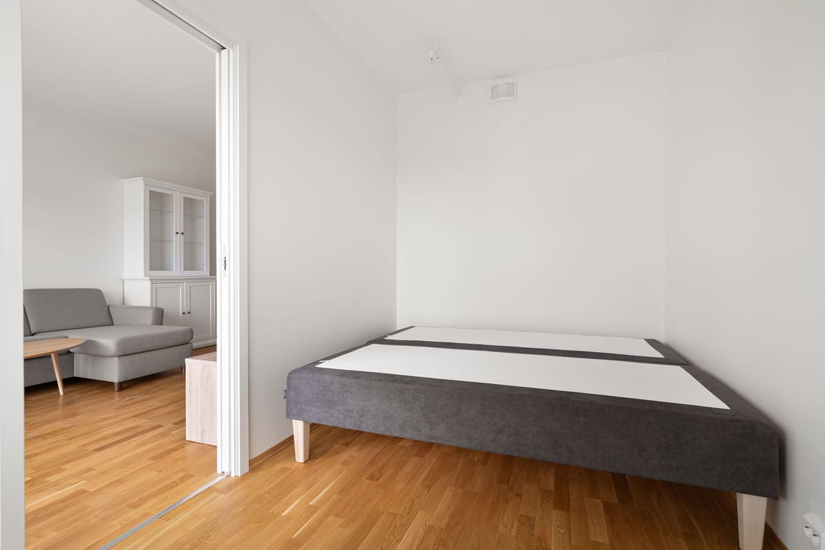 Photo by Lisa Anna on Pexels
White sounds like the simplest choice and is often the trickiest, because “white” almost never means pure white. These five are the ones designers keep coming back to:
- Benjamin Moore White Dove: A soft, warm white with the faintest hint of gray. Works beautifully on trim and cabinetry, and holds up as a wall color in rooms with plenty of natural light.
- Benjamin Moore Simply White: Slightly brighter and cleaner than White Dove, with almost no yellow. A reliable trim white that doesn’t read stark.
- Sherwin-Williams Alabaster: Warm, creamy, and famously forgiving. One of the most popular whole-house whites for a reason: it reads warm without tipping into yellow.
- Sherwin-Williams Pure White: A true, balanced white with just enough warmth to avoid looking clinical. A good middle ground between Alabaster and a crisp white.
- Behr Swiss Coffee: An accessible, widely stocked warm off-white that works on walls or trim in both north- and south-facing rooms.
If your room faces north and gets cooler, indirect light, lean toward Alabaster or White Dove. South-facing rooms with strong direct sun can handle a crisper white like Simply White without it feeling cold. And if you want maximum brightness and don’t mind a cleaner, less cozy look, a true crisp white (like BM Chantilly Lace) will beat any of these softer options, just know it shows every shadow and imperfection on the wall.
The Best Greige Paint Colors (The “Goes With Everything” Family)
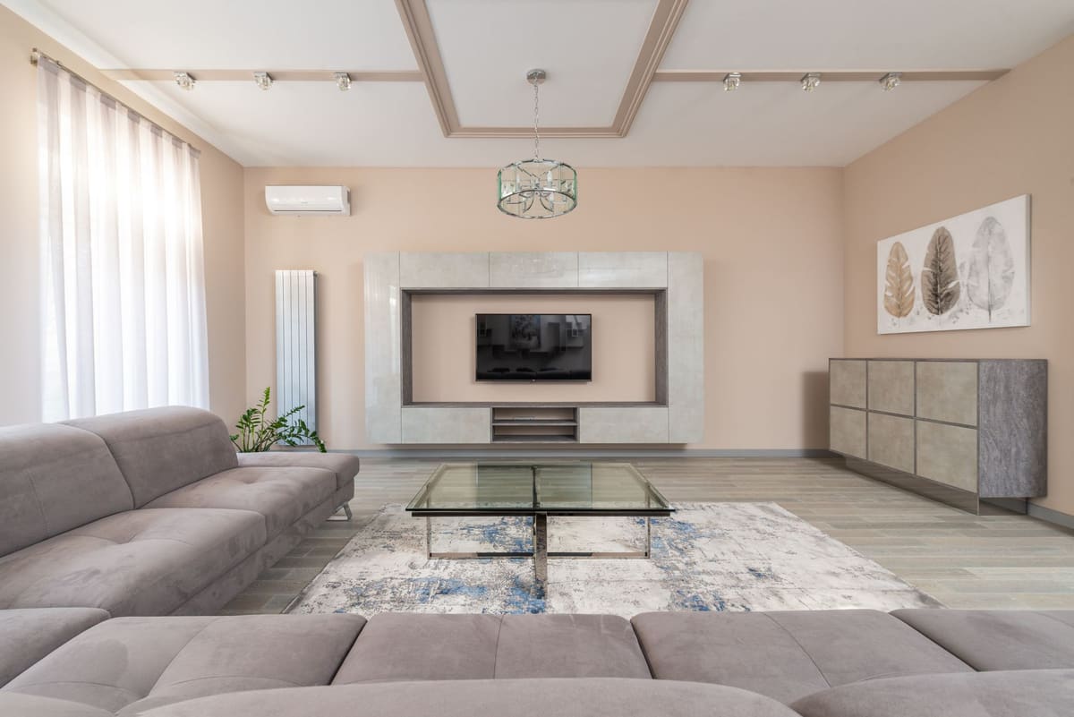 Photo by Max Vakhtbovych on Pexels
Greige, a blend of gray and beige, is the safest timeless bet in the entire neutral category because it bridges warm and cool decor without fully committing to either. If you only remember one family from this list, make it this one.
- Sherwin-Williams Agreeable Gray: The best-selling neutral for a reason. It reads warm gray in some light, soft beige in others, and flatters almost any flooring.
- Benjamin Moore Edgecomb Gray: A lighter, airier greige with a gentle warmth that works well in smaller or darker rooms.
- Benjamin Moore Revere Pewter: A deeper, moodier greige that leans slightly green in some light and slightly taupe in others. A favorite for living rooms and dining rooms.
- Sherwin-Williams Accessible Beige: Warmer than Agreeable Gray, with enough beige pulled forward to feel cozy rather than cool.
- Benjamin Moore Classic Gray: One of the lightest grays on this list, nearly a warm off-white, popular for ceilings and trim as well as walls.
Because greige sits right in the middle of the color wheel, it pairs with wood tones, black metal, warm brass, and cool chrome equally well. That flexibility is exactly why it outlasts trends: your furniture and finishes can change around it for years and it will still make sense.
The Best Warm Beige & Taupe Paint Colors
For rooms that need warmth more than anything else, bedrooms, living rooms, and low-light spaces, true beiges and taupes do more heavy lifting than any gray can.
- Sherwin-Williams Accessible Beige (read warmer here than in the greige section): In rooms with less natural light, this color pulls toward a cozy, golden beige rather than its grayer side.
- Benjamin Moore Pale Oak: A soft, barely-there greige-beige that reads almost white in bright light and warms up considerably in the evening. Extremely versatile.
- Warmer “buttercream” and golden-beige neutrals: Good options when a room needs to feel enveloping rather than airy, think a den, a primary bedroom, or a reading nook.
- True taupes: Slightly darker and more saturated than beige, taupes add depth to a wall without going as dark or dramatic as a true brown. Good for accent walls or rooms that get a lot of light and can handle the extra depth.
Rule of thumb: the less natural light a room gets, the more warmth you want in your neutral. A cool gray in a dim, north-facing bedroom will often look flat and lifeless; a warm beige or taupe in the same room will feel finished.
The Best Soft Gray Paint Colors That Still Feel Current
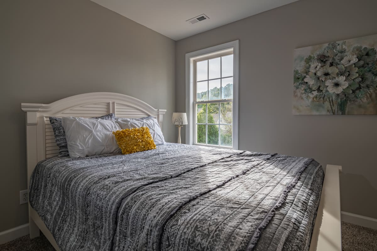 Photo by Curtis Adams on Pexels
Gray isn’t dead, the flat, icy grays of a decade ago are. What’s replaced them are grays with just enough warmth mixed in to avoid that cold, sterile look.
- Sherwin-Williams Repose Gray: A warm, light gray that’s become one of the most reliable “safe” picks for open-concept homes. Flexible enough to flow from kitchen to living room to hallway.
- Sherwin-Williams Mindful Gray: A touch darker and warmer than Repose Gray, with a cozier, more grounded feel.
- Benjamin Moore Balboa Mist: A very light, warm gray that reads almost greige in some light. A popular whole-house choice for its ability to stay bright without feeling cold.
The trick to keeping any gray from reading cold is what you pair it with. Warm wood tones (oak, walnut, rattan), brass or warm-toned black hardware, and warm-white bulbs (2700K to 3000K, not daylight-toned LEDs) all push a gray toward cozy instead of clinical.
Neutrals to Skip: What Actually Dates a Room
Most neutral paint guides stop at “here’s what to pick.” Just as useful is knowing what to avoid, because these are the choices that quietly date a room faster than any bold color would.
- Ultra-cool “greige” that’s secretly blue-gray. A lot of 2012-era greiges lean far cooler than their name suggests. Next to warm wood floors or brass fixtures, they can look dingy rather than sophisticated.
- Muddy or peachy builder beige. The flat, slightly pink-beige that shows up in new-construction spec homes reads instantly dated and clashes with almost every other color in a room.
- Any neutral with one loud, single undertone. A paint that’s strongly, obviously green, pink, or purple under the wrong light will fight your fixed elements (flooring, countertops, cabinetry) instead of complementing them.
That last point leads to the single most useful rule in this whole guide: the fixed-elements rule. Choose your neutral to match the undertones you can’t change, your floors, your countertops, your tile, not the other way around. A paint color is one of the easiest and cheapest things in a room to change. Your hardwood floors are not.
How to Sample and Test (The Step Nobody Should Skip)
 Photo by RDNE Stock project on Pexels
Every neutral on this list can look wrong in your house if you skip this step. Paint chips are small, printed on glossy stock, and lit by store lighting that has nothing to do with your room.
Tape up at least a 2x2 foot swatch, either painted sample boards or a peel-and-stick sample, directly on the wall you’re planning to paint. Then look at it three separate times: in the morning when the light is cool and indirect, in the afternoon when the sun is strongest, and in the evening under your actual lamps and overhead fixtures. A color that looks perfect at noon can shift noticeably once the sun goes down.
While the sample is up, hold it next to your flooring, your trim, and the largest piece of furniture that will stay in the room. If it clashes with any of those fixed elements, it will clash on the full wall too, just at a much bigger scale.
How to Pair Neutrals for a Whole-Home Flow
If your home has an open floor plan or rooms that flow into each other, consistency matters more than any single color choice. Pick one neutral undertone family (warm greige, cool gray, warm white) and carry it through connected spaces, even if you vary the LRV from room to room for mood. A warm greige living room that opens into a cool-gray hallway will feel disjointed no matter how nice each color looks on its own.
A simple approach: choose one neutral as your through-line color, then use the 60-30-10 rule to layer in secondary and accent colors on top of it, room by room. The neutral becomes your 60%, and everything else, upholstery, rugs, art, gets to carry the personality. If one connected room wants to stand out without breaking the flow, adding an accent wall there is an easy way to do it while keeping the rest of the space on the same neutral.
Frequently Asked Questions
What is the most timeless neutral paint color?
Greige picks like Sherwin-Williams Agreeable Gray and Benjamin Moore Revere Pewter top most designers’ lists because they flex between warm and cool decor without committing fully to either, which keeps them from aging out of a trend cycle.
What are the three main neutral colors?
White, gray, and beige are the three core neutral families, with greige acting as the popular hybrid that blends gray and beige into one flexible color.
What neutral paint color goes with everything?
A balanced greige or a soft warm white reads clean against nearly any accent color, wood tone, or metal finish, which is why those two categories dominate “best neutral” lists.
What’s the difference between warm and cool neutrals?
Warm neutrals lean yellow, red, or pink and feel cozy and grounded, while cool neutrals lean blue, green, or violet and feel fresher and more modern. Neither is objectively better; it depends on your room’s light and your existing finishes.
Why do neutral paint colors never go out of style?
They’re low in saturation, which means they work across different lighting conditions and decor styles instead of tying a room to one specific trend cycle the way a bold, saturated color can.
How do I stop a gray from looking cold or dated?
Choose a warmer gray, like Sherwin-Williams Repose Gray or Benjamin Moore Balboa Mist, and pair it with warm wood tones and warm-white (2700K to 3000K) light bulbs instead of daylight-toned LEDs.
Do I really need to sample paint before buying?
Yes. Tape up at least a 2x2 foot swatch and view it in morning, afternoon, and evening light before committing to a full room, since undertones can shift dramatically between a store chip and your actual wall.
What neutral works best for a north-facing (low-light) room?
A warm white or warm greige is the safer choice, since cool undertones tend to look flat and gray in the indirect, bluish light that north-facing rooms get.
The Takeaway
The best neutral paint colors aren’t a trend to chase, they’re a decision you make once, carefully, and then stop thinking about. Match the undertone to your room’s light and fixed finishes, tape up a real sample before you commit, and whichever one of these you land on will still look right in ten years. If you’re planning color for more than one room, that whole-house planning is worth doing before you buy a single gallon.


